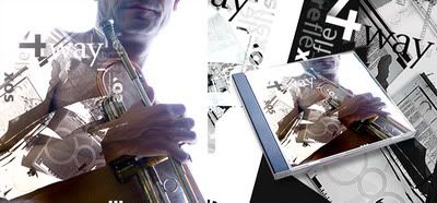
Dynamic flow in Simplicity is what his design is. You'll see many of his poster designs are actually amazing composition between highly photography effect and modern typography layering. Nevertheless, he always passionate to snap urban spots and even the multicultural urbanity in it.
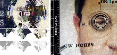
A conceptual photograph of his, titled "Communication" is one of my favorite. Smartly taken as a simple daily portrait of how the urbanists are moving time and moving life with a communication tool.
Communication by ~RuiVieira on deviantART
Sometimes, his inspiration comes from cityscape corner or high rise architecture building. The "Linha Tejo" poster design series are displaying architectural element that collaborates carefully-picked typography.
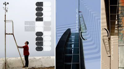
Another instance of archi-typo poster designs of Rui Vieira could be "Headline" and "Zero2"
Headline by ~RuiVieira on deviantART
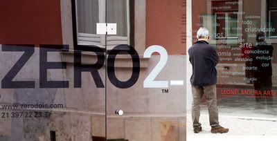
He has decided to move from Blogger to Wordpress blog platform to get more enhanced features on posting his poster design and photography. Be sure to visit Rui Vieira Graphic Design website if you're interested to see his design portfolio. You can also visit Rui's DeviantART profile with great deviation ;)
This article post is a contribution to "Design you love: a group writing project". (Thank you to Mirko of Designer Daily who made this event possible). A late submission I know :D (due to my heavy scheduled tasks) but the main thing is that: I hope you all will enjoy this short design review. I've missed the blogging days moment and I miss replying wonderful comments posted by the wonderful you! Have a great weekend everyone :)

Thank you very much Audee!
ReplyDelete