Should this be a new way to get along with other bloggers across the globe...Here are the Estetica Graphic Design Group Interviews round up. Enjoy :)
My Estetica Blog Interview by Jacob Cass
Interview with GraphicIdentity by Caroline Murphy
Featured Designer #6 - Lauren Marie / Creative Curio by Alex
Designer Interview: Ian M by Lauren Marie
Interviewing Jacob Cass! by Graphic Identity
Interview With Crazleaf Design Blog by Toon
Estetica Designer Bloggers Interviews by ianm
An interview with Caroline Murphy by Aaron

Wednesday, April 23, 2008
How to Create a Ribbon Using Blend Effect in Illustrator
About two weeks ago, I’ve made a set of floral Photoshop brushes that has some kind of bend or twirl ribbon effect in it. I got respons on flickr asking me of how I made the effect.
Somehow it is so easy and quick to produce. Lets get start now :D
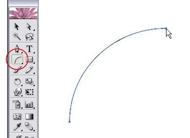
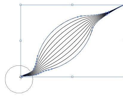
Step 1 – Draw a curve with arc tool
Find the arc tool in the tool box, and start to draw a curve on a new canvas like this:
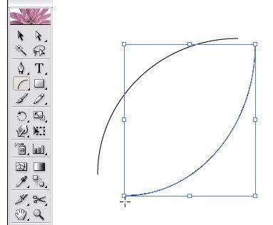
And draw another curve next to the first curve that you made.
Connect each edge point so it becomes a closed curves paths like this:
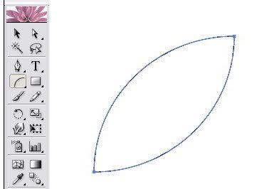
Remember: do not group those two paths because if you group it, you won’t find a nice blend effect as this tutorial will show you in the finish result.
Step 2 – How to blend
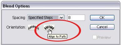
OK, now go to the menu Object > Blend > Blend Option and set it like what you see here:
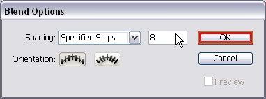
You can fill the Specified Steps with 10 or more. Just to let you know that the more you add the number of density of the specified step then you would create more dense curve lines.
Don’t forget to set the orientation of the blend as align to path.
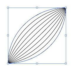
Back again to the menu, go to Object > Blend > Make (Alt + Ctrl + B), then soon you will see this on your canvas:
Step 3 – Creating a nice ribbon using warp tool.
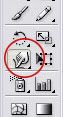
Find a Warp Tool on the tool box. Warp tool is actually my favorite tool to create curves for my photoshop brushes collections ;)
Start to pull each edge of curve with this warp tool like you see below by dragging and release it until you feel the shape is perfect. You can do it repeatedly until you get a nice curve:
As you can see, we still manage the both edge. Now we try to tweak the center curve lines. Still using the warp tool, do it exactly as I told you in the previous step but now be focused on the center curves only.
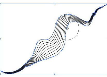
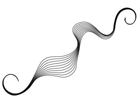
You will love this step, because every time you drag using the warp tool, you will get a random bends effect. Experiment a bit on another spot of curve lines. You don’t have to worry if somehow you see like broken curves after sometimes, just repeatedly shape the curve lines, you will get a nice ribbon effect again if you try a little bit harder. And here is my final result:

Somehow it is so easy and quick to produce. Lets get start now :D
Step 1 – Draw a curve with arc tool
Find the arc tool in the tool box, and start to draw a curve on a new canvas like this:

And draw another curve next to the first curve that you made.

Connect each edge point so it becomes a closed curves paths like this:

Remember: do not group those two paths because if you group it, you won’t find a nice blend effect as this tutorial will show you in the finish result.
Step 2 – How to blend
OK, now go to the menu Object > Blend > Blend Option and set it like what you see here:

You can fill the Specified Steps with 10 or more. Just to let you know that the more you add the number of density of the specified step then you would create more dense curve lines.
Don’t forget to set the orientation of the blend as align to path.

Back again to the menu, go to Object > Blend > Make (Alt + Ctrl + B), then soon you will see this on your canvas:

Step 3 – Creating a nice ribbon using warp tool.
Find a Warp Tool on the tool box. Warp tool is actually my favorite tool to create curves for my photoshop brushes collections ;)

Start to pull each edge of curve with this warp tool like you see below by dragging and release it until you feel the shape is perfect. You can do it repeatedly until you get a nice curve:

As you can see, we still manage the both edge. Now we try to tweak the center curve lines. Still using the warp tool, do it exactly as I told you in the previous step but now be focused on the center curves only.

You will love this step, because every time you drag using the warp tool, you will get a random bends effect. Experiment a bit on another spot of curve lines. You don’t have to worry if somehow you see like broken curves after sometimes, just repeatedly shape the curve lines, you will get a nice ribbon effect again if you try a little bit harder. And here is my final result:

Weekly Blogroll Links - April 23rd 2008
WEB DESIGN
Free Wordpress themes pack #1 - April 08 by Alex
GRAPHIC DESIGN
Mariedesbons Illustrations by Toon
PROs And CONs Of Going Solo by Vivien
The Best Graphic Design Articles from 34 Top Design Blogs as Chosen By The Authors Themselves by Jacob Cass
Free Twitter Graphics by Randa Clay
10 Tips for Writing Graphic Design Briefs by David Airey
PHOTOSHOP RESOURCES
Beginner Photoshop Tutorial by D-sine
50 Essential Photoshop Text Tutorials by Vandelay Website Design
Outlined Swirls Photoshop Brushes. Lookin’ Better Than Ever! by BSilvia
Mastering Photoshop Masks: Vector Masks by Creative Curio
ART
Spettacolo Pomeridiano: Iperborea by Lordsomber
TYPOGRAPHY
Sunday Type: Matrix Type by johno (iLT)
BLOGGING
Building Backlinks with doFollow blogs & the Do Follow,CommentLuv and KeywordLuv Blog List by Abhinav Sood
PERSONAL POST
You have Got to be Kidding?? by Nunyaa
Monday, April 14, 2008
Interviewing Jacob Cass!
Meet Jacob Cass, a very talented graphic designer from Australia, and a great blogger as well. He is curently taking part in a cross interviewing events of Estetica Graphic Design Group Interviews and this is the interview result that we did previously:
Q: JustCreativeDesign.com is your new blog which I think is quite a success. How can you manage your time as a student and as a graphic designer and a blogger at the same time?
JC: It comes quite naturally as I am very good at multi tasking. You will usually find me designing and blogging at the same time (probably along with another 15 or so tabs open in Firefox). Also it comes down to me just loving what I do so time just flies by. My typical day would be me waking up at 9 or 10, then getting to bed at 12 or 1am so I do make the most of my time.
Q: You describe yourself as an enthusiastic, sceptical, eloquent and a focused person. When u meet a new client, or are in the middle of designing process, how far do those attitudes help you out?
JC: Well being passionate and enthusiastic is a bonus within any industry and I suppose having these qualities helps build up trust within the client which is an important aspect in this business.
Q: How did you get started in design or how long have you been doing it for?
JC: I got started in design when I was 12 when I put my first website on the web for my local basketball team. It consisted of lots of animated gifs and cool graphics, quite embarrassing really. That was my first taste of design then when I was 15 I started running a website called PartyPhotos for my school friends showcasing photographs from the weekend (this was before Myspace or Facebook). Ever since then I got hooked on graphics and couldn't stop designing.
Q: What kind of project will always be your favourite?
JC: To be honest I love the university projects that I receive as I get total freedom and can be very creative but I suppose this will change when I graduate next year. What will happen then, who knows?
Q: A designer can stand out with an idealistic idea or go with the flow as the client said. How do you see yourself in this dilemmatic situation?
JC: It all comes down to communicating with the client on what would be the best decision and you would look at the best options and weigh out the positive VS the negative.
Q: Do you use any special techniques and tools, such as a tablet, or is it mainly the mouse doing all the work?
JC: Mainly my imagination, an A3 Sketch Pad, a pencil and my mouse. A graphics tablet is on my Christmas wish list though.
Q: When you write an article for your blog, do you think there is a certain trend among your readers to read different sorts of resources on the internet rather than professional tips or a discussion topic?
JC: Well as far as I know I have a pretty unique blog as I write up about personal university projects as well as providing tips and other resources from the perspective of a graphic design student. I don't know of any other blogs that do this so I suppose there is no specific trend in my niche.
Q: What is your favourite music and movie genre?
JC: Definitely electronic dance music. Some of my favourites are The Presets, Pnau, any compilation from Ministry of Sound and a trillion other different djs both local and international. But in saying this, I also dive into many other areas of music tastes... which would be proven by my 41gb of music (7750+songs).
My favourite movie genre is probably the big blockbusters with all of their awesome special effects but I also like a good thriller.
Q: If you have a chance to express your skill for a personal design portfolio, how is it going to look like? I mean, you can tell us what kind of design style that you're going to use the most?
JC: I don't tie myself down to one particular style. If you have seen my work you will notice that they are all so different which is how I would like to be seen ... that being versatile.
Q: The last question, what are your other main hobbies when you're not designing?
Well to be honest that is my main hobby if you can call it that but other than that I really like just being around my mates. It's a guaranteed good time if I am around them.
JC: I also go to the beach quite a bit, and I go out clubbing probably twice a week and I go to a lot of festivals and dance concerts. I used to play sport however this year I wanted to focus more on design. I also go cruising / fishing on our boat every month or so.
So now I hope you will know about Jacob Cass better than before and learn something from this interview. Thank you Jacob for the great interview and all the best to you! ;)
Weekly Blogroll Links - April 14th 2008
WEB DESIGN
Change Your WordPress Admin Password! by Dale
170 Full Flash Website Templates / Part 1 by Bilge Ilios Berberoglu
GRAPHIC DESIGN
Sigma Chi has 'Identity Crisis!' by Jeff Fisher
Using Photomerge for Stunning Panoramic Photos (and some tips for shooting panoramics) by Chad Neuman
Imallfake by DesignDiary.org
ART and DESIGN
DeKast by DotDotDesign.org
TECHNOLOGY
52LG50 Hot LCD Flat Panel TV Brings It In Clear by Robert Di-Salvo
PHOTOGRAPHY
Wide-Angle Lens by Stephen Bruno
Tyler Gray Photography by Open Eye Photography Blog
PERSONAL POST
The Story of My Gratitude Pen by Mark
Thursday, April 10, 2008
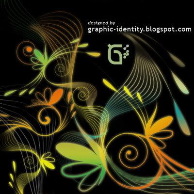
Fantasy Floral Photoshop Brushes - Part 4
I've been busy with some blogging activity events, now I'm coming back again with another vector Photoshop brush set to download for free. I have added the 4th Fantasy Floral Photoshop Brush set series until now. There are 3 variations for you to choose and I was experimenting with multiple layered curves lines.
I'm not sure of how to distinguish the type of these photoshop floral brush style... I guess you are free to comment on this post to figure out what it is.
I made these PS brush set simple and clean...hope that you will like the them ;)
Some comments lead me to give you quick tips to optimize the use of Graphic Identity Floral Photoshop Brush set series pack. My brush collections are actually so simple in shape... but if you want to give dramatic effect, I suggest you to use multiple layers for different size brush tip. This would make easy when you want to put different style of gradients, oppacity, or glowing FX and oppacity for the each layers. Another thing is to apply free transforming to it, such as rotating and fliping to have more variation of shapes.
Each of brush is categorized as high-res in size (1600px - 2300px).
Read More
Estetica Graphic Design Group Interviews
Graphic Identity has been invited for a cross interviewing event between Design Bloggers held by Estetica Graphic Design Forum.
Toon, the admin of Estetica Design Forum, has a such brilliant idea to sort this unique interview event. There are 8 designers participating and Graphic Identity Blog has been choosen randomly to interview Jacob Cass from Just Creative Design
and at the same Graphic Identity Blog will also be interviewed by Caroline Murphy of Caroline Murphy's Designs.
The 8 Design Blogs Taking Part Are:
The Digital Revolution Blog will interview Aaron Russell's Blog
Caroline Murphy's Design Blog will interview Graphic Identity Blog
Estetica Graphic Design Blog will interview Crazyleaf Design Blog
The Creativecurio Blog will interview The Digital Revolution Blog
Graphic Identity Blog will interview Just Creative Design Blog
Crazyleaf Design Blog will interview The Creativecurio Blog
Just Creative Design Blog will interview Estetica Graphic Design Blog
Aaron Russell's Blog will interview Caroline Murphy's Design Blog
The final interviews will be posted on Graphic Identity blog as all the interviewed participants will do the same thing next week. If somehow you get courious of how this interviewing round up will be published later on, you can subscribe to Graphic Identity Blog to follow the next update.
Toon, the admin of Estetica Design Forum, has a such brilliant idea to sort this unique interview event. There are 8 designers participating and Graphic Identity Blog has been choosen randomly to interview Jacob Cass from Just Creative Design
and at the same Graphic Identity Blog will also be interviewed by Caroline Murphy of Caroline Murphy's Designs.
The 8 Design Blogs Taking Part Are:
The final interviews will be posted on Graphic Identity blog as all the interviewed participants will do the same thing next week. If somehow you get courious of how this interviewing round up will be published later on, you can subscribe to Graphic Identity Blog to follow the next update.
Saturday, April 5, 2008
Weekly Blogroll Links - April 5th 2008
Since blogging brings a huge phenomenon to the internet world and for our inspirational thoughts, starting by this weekend and ahead, Graphic Identity will publish Weekly Blogroll Links that are consist of great article links on various topics.
You can subscribe Graphic Identity by email or RSS feed if you like to follow the next week Blogroll Links update :D
The featured blog post listed below are coming from my friend's blogs and from other blog articles or resources I've followed. They are mostly came from Graphic Design Group. I wrote a post about Blog Catalog Graphic Design Group Widget, and please join the group discussion to have your blog featured in the next Graphic Identity Blogroll Links ;)
Have a great weekend friends!
WEB DESIGN
102 Free WordPress Themes Promotion Websites by Pachecus
GRAPHIC DESIGN
How to design a cool 3 dimentional Globe with easy 10 steps by M. Fayaz
In the Trenches at Sea: The Crucible of Character by Lordsomeber
Free Vector – Wings by The_Chemist
American Artist: Drawing highlights by Fossfor
When Photoshop attacks … by Digital Design Cottage
Children's Book Illustration by Manu Martin
PHOTOGRAPHY
A Vision of Bliss by Cosmicsurfer
ART
Surprise Orders & Re-orders by Quachee
oj by dotartdude
Lili Bday by lafabegrafik
TECHNOLOGY
Internet Explorer 8 Public beta by Alex
Small, Elegant, and Rich Sounds - Shure SE530PTH by Design Sanctuary
BLOGGING
How can Reading Blogs help you? Read to know! by Abhinav Sood
Abhinav Sood is a Meta Blogging blog author, and he has wrote lots of great blog reviews.
PERSONAL POST
Rowan's Bee Shop & Apiary by Moonshadow
MY BOY Vincent by Marko
The sun's rim dips ; the stars rush out ; At one stride comes the dark. by BillyWarhol
Friday, April 4, 2008
Hire Us
Graphic Identity Blog is graphic designers that work in a group. We blog everything related to design and you can hire us.
We are specialized on these field:
Contact us by email: graphicidentity.blog@gmail.com
or you can send us messages via Facebook Page or tweet us on Twitter
You can now hire us on Envato Studio service for
Request a quotation by sending us:
Logo design projects compilation in the year of 2011. See more logo designs on Behance Portfolio

You can fav or spread the words about Graphic Identity works on Flickr
We are specialized on these field:
- Web Development (CSS-XHTML, Twitter Bootstrap, WordPress, CodeIgniter)
- Graphic Design (icon set, poster, illustration, PDF layout, card, GIF animation, banners)
- Visual Identity (logo, business card, letterhead, pocket folder, envelope design)
- Typography (lettering, logotype, intermediate font design)
Contact us by email: graphicidentity.blog@gmail.com
or you can send us messages via Facebook Page or tweet us on Twitter
You can now hire us on Envato Studio service for
- Custom Handwriting & Lettering
- Product Usage Instruction Steps Illustration
- Creative and Unique Business Cards
- Custom Icon Set for Brand and Web
- Logotype Design
- Exclusive Logo Design
- Horizontal Repeated Pattern Background (New Service)
Request a quotation by sending us:
- Web Design Questionnaire
- Graphic Design Questionnaire (will be available soon)
Logo design projects compilation in the year of 2011. See more logo designs on Behance Portfolio
You can fav or spread the words about Graphic Identity works on Flickr
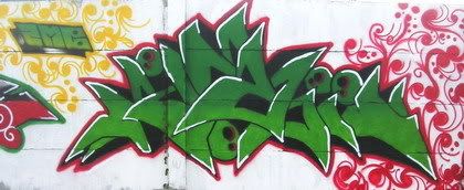
Cultural Touch Inside the Graffiti Walls
More than a week ago, I wrote a guest blog post at InspirationBit.com. That was my very first guest blog post, and I was so happy that Vivien (the author of Inspiration Bit) gave me such a wonderful opportunity to contribute something on her blog.
I've included some photos of Graffiti Walls at my neighborhood, and I think it was a fun small research that I'd like to share with you since generally I believe there are some connections between those graffiti art and the local social culture.
Have a comment on the guest blog post to discuss or just to tell a story about graffiti around your neighborhood if you like :D
Graffiti - Graphic Design Developed From Older Cultures

Tuesday, April 1, 2008
Design Style Tutorial: SIMPLICITY IN WEB 2.0 (Part 2)
Today’s tutorial is a follow up of the previous post: Design Style Tutorial: SIMPLICITY IN WEB 2.0 (Part 1). Mastering CSS may need sometimes and hard work. I’m still learning to improve what I know about it. I began to learn CSS since 4 years back. My favorite designer who has implemented such excellent integration between CSS and her blog is Veerle’s Blog. It was her old short post about CSS vs tables that started me to understand the neat order of CSS. CSS make the designing process easy and quicker to finish. When you need to change something on your layout, you don’t have to work from the start to fix it! That is: CSS… ;)
This tutorial will show you how to use CSS to create rollover image buttons/menus using relative position. There maybe some other ways to create the same rollover effect. I’ve learnt about this from Veerle’s old post about Div thinking cap. I wasn’t realizing of how important this technique for my design until I had a project that required me to create uneven (unordered) menu placement with lots of motive texture as the background.
If you get interested or you even still don’t get me :p , please have a look to the demo webpage. And let’s have fun with this tutorial!
CSS DEMO >>
GETTING READY WITH THE IMAGE ICON
Step 1 – Creating a master background
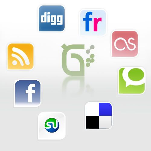
Create a master background using Photoshop, Be creative as your background design can be part of header, sidebar decoration, search box or any part in your website. My example here is simple :D I just want to show how these random positions of buttons / icons are possible to be done with CSS relative position techniques. The icons that I’ve used for the design are Social networking icons created by FreakGroup.com.ar.
They are very nice icons with smooth gradients FX on each of it. The Facebook and Stumble Upon icons are not included in the download pack; because of it I have designed them with the same style as what in the pack.
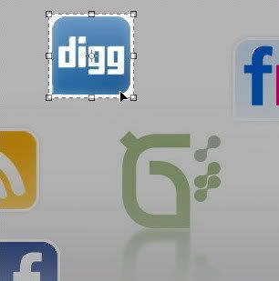
Step 2 – Cropping
After you finish, save the file both in .JPG and .PSD then duplicate the .PSD as a new file. The next thing to do is to crop the image of button or icon that you wish to have rollover FX on it. After that, merge the layers down.
NOTE: I think .PSD saved format will help a lot if you need any changes to the layout or the icons. So consider to always save the master background in .PSD file as backup.
Step 3 – Working with the cropped image icons
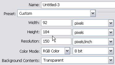
You will need to put on a note about the precise image size of your cropped icon. In this case, the size was 92px x 92 px. Create a new file with the exact width (92 px) of icon size but put it doubled for the height, that is 184px. Make sure that you always create a new file with the same image resolution as the first image background.
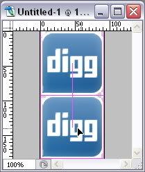
Go back to the cropped icons file and duplicate the background layer. Then drag to the new empty file that you’ve just made. Show the smart guides by entering menu: View > Show > Smart Guides. Place the icons layer on the top of the empty file. The smart guides will show the exact alignment as you can see red thin line appeared if your icon layer edge hit the image border. Duplicate the icon layer to have another same icon image and place the second copied layer to the bottom side. Below is an illustration of the precise layers placement.
Step 4 – Adding gradient effect for the rollover icon stage
Work on the bottom icon layer, and create selection using Rectangular Marquee Tool.
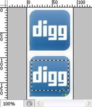
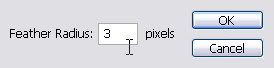
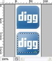
Go to the menu Select > Feather (Alt + Ctrl + D) and fill the Feather Selection Radius for 3px.
Find the Gradient Tool. Set the Default Foreground and Background color or by pressing D key, and put the settings on the menu options just as shown below:

Be sure that Dither and Transparency box are checked.
Drag your cursor into the selected area until you get the nice gradient effect as you desire.
The result should be like this:
Save the file as .GIF file and do the same with the rest of the icons (begins from the Step 2).

NOTE: You can create rollover state effect with your own creativity. If you have unrasterized fonts on your button or icon, you can change the color of the font and styles to differentiate it from default state.
INTEGRATING ICONS TO THE LAYOUT
Step 1 – The master background’s CSS
You will need the master background image that was created on the first step of the previous section. The styles consist of this:
Step 2 – The icon’s CSS
Now it is time to put rollover effect to the icons. The good thing about using this CSS technique is because there is no (loading) delay when people mouse over the icons. The icons image that we’ve created in the previous stage are included both the default and rollover state. Let me show you the CSS to achieve this effect:
Presumably you find some problem in I.E. 6, you can add this short CSS hack:
Step 3 – The HTML structure
The relative positioning in this CSS technique should be better applied than absolute positioning. Because absolute position would make the icons stays at a certain location even when the window resized.
Veerle explained this on her tutorial Div thinking cap, The left and top coordinates are always in reference with the container it is in. In our example that is the background-button div container since the icons is part of the background-button. This is the HTML structural markup:
Step 4 – Icons to background positioning
In order to get the top and left coordinate’s position value just like the Icon’s CSS above; you will need to experiment with numbers. This process is quite alike to a puzzle game actually :D. I suggest that you can start with the range of 100px for both top and left positions and see how it looks on the layout after you save the CSS settings. After that try to decrease or increase the position value for each position. Resave the file and reload or (ctrl + R) your browser to do the position check. Do it for several times and by this time, you should notice how much exactly the numbers of value to be added until you get the nice position of the icon as the master background shows. Sometimes you may go with negative value as well to fit your icons to master background. :D Crafty but it works!
Do the same step 2 and step 3 with the other icons.
Hey I have no idea to make these things whole lots easier, maybe you can suggest me something guys, just feel free to comment if you like! :*
Related Post:
This tutorial will show you how to use CSS to create rollover image buttons/menus using relative position. There maybe some other ways to create the same rollover effect. I’ve learnt about this from Veerle’s old post about Div thinking cap. I wasn’t realizing of how important this technique for my design until I had a project that required me to create uneven (unordered) menu placement with lots of motive texture as the background.
If you get interested or you even still don’t get me :p , please have a look to the demo webpage. And let’s have fun with this tutorial!
CSS DEMO >>
GETTING READY WITH THE IMAGE ICON
Step 1 – Creating a master background
Create a master background using Photoshop, Be creative as your background design can be part of header, sidebar decoration, search box or any part in your website. My example here is simple :D I just want to show how these random positions of buttons / icons are possible to be done with CSS relative position techniques. The icons that I’ve used for the design are Social networking icons created by FreakGroup.com.ar.
They are very nice icons with smooth gradients FX on each of it. The Facebook and Stumble Upon icons are not included in the download pack; because of it I have designed them with the same style as what in the pack.

Step 2 – Cropping
After you finish, save the file both in .JPG and .PSD then duplicate the .PSD as a new file. The next thing to do is to crop the image of button or icon that you wish to have rollover FX on it. After that, merge the layers down.
NOTE: I think .PSD saved format will help a lot if you need any changes to the layout or the icons. So consider to always save the master background in .PSD file as backup.

Step 3 – Working with the cropped image icons
You will need to put on a note about the precise image size of your cropped icon. In this case, the size was 92px x 92 px. Create a new file with the exact width (92 px) of icon size but put it doubled for the height, that is 184px. Make sure that you always create a new file with the same image resolution as the first image background.

Go back to the cropped icons file and duplicate the background layer. Then drag to the new empty file that you’ve just made. Show the smart guides by entering menu: View > Show > Smart Guides. Place the icons layer on the top of the empty file. The smart guides will show the exact alignment as you can see red thin line appeared if your icon layer edge hit the image border. Duplicate the icon layer to have another same icon image and place the second copied layer to the bottom side. Below is an illustration of the precise layers placement.

Step 4 – Adding gradient effect for the rollover icon stage
Work on the bottom icon layer, and create selection using Rectangular Marquee Tool.

Go to the menu Select > Feather (Alt + Ctrl + D) and fill the Feather Selection Radius for 3px.

Find the Gradient Tool. Set the Default Foreground and Background color or by pressing D key, and put the settings on the menu options just as shown below:

Be sure that Dither and Transparency box are checked.
Drag your cursor into the selected area until you get the nice gradient effect as you desire.
The result should be like this:

Save the file as .GIF file and do the same with the rest of the icons (begins from the Step 2).

NOTE: You can create rollover state effect with your own creativity. If you have unrasterized fonts on your button or icon, you can change the color of the font and styles to differentiate it from default state.
INTEGRATING ICONS TO THE LAYOUT
Step 1 – The master background’s CSS
You will need the master background image that was created on the first step of the previous section. The styles consist of this:
#background-button {
width:500px;
height:500px;
display:block;
background-image: url(..../image/demov1.jpg);
background-repeat: no-repeat;
margin-left:130px;
}
Step 2 – The icon’s CSS
Now it is time to put rollover effect to the icons. The good thing about using this CSS technique is because there is no (loading) delay when people mouse over the icons. The icons image that we’ve created in the previous stage are included both the default and rollover state. Let me show you the CSS to achieve this effect:
#digg ul {
width: 92px;
height:92px;
position: relative;
float:left;
top:13px;
left:125px;
background-image: url(..../image/digg2.gif);
z-index: 150;
list-style-type: none;
}

#digg ul li a {
background: url(..../image/digg2.gif) no-repeat left top;
width: 92px;
height: 92px;
display: block;
text-indent: -9999px;
text-decoration: none;
}

#digg ul li a:hover {
background: url(..../image/digg2.gif) no-repeat left bottom;
}
Presumably you find some problem in I.E. 6, you can add this short CSS hack:
* html # digg ul {
top: 3px; }
Step 3 – The HTML structure
The relative positioning in this CSS technique should be better applied than absolute positioning. Because absolute position would make the icons stays at a certain location even when the window resized.
Veerle explained this on her tutorial Div thinking cap, The left and top coordinates are always in reference with the container it is in. In our example that is the background-button div container since the icons is part of the background-button. This is the HTML structural markup:
<div id="background-button">

<div id="digg">
<ul>
<li>
<a href="http://digg.com/users/kukuhumi/" title="Graphic Identity Digg profile" target="_blank">Graphic Identity Digg profile </a>
</li>
</ul>
</div>

</div>
Step 4 – Icons to background positioning
#digg ul {
width: 92px;
height:92px;
position: relative;
float:left;
top:13px;
left:125px;
background-image: url(..../image/digg2.gif);
z-index: 150;
list-style-type: none;
}
In order to get the top and left coordinate’s position value just like the Icon’s CSS above; you will need to experiment with numbers. This process is quite alike to a puzzle game actually :D. I suggest that you can start with the range of 100px for both top and left positions and see how it looks on the layout after you save the CSS settings. After that try to decrease or increase the position value for each position. Resave the file and reload or (ctrl + R) your browser to do the position check. Do it for several times and by this time, you should notice how much exactly the numbers of value to be added until you get the nice position of the icon as the master background shows. Sometimes you may go with negative value as well to fit your icons to master background. :D Crafty but it works!
Do the same step 2 and step 3 with the other icons.
Hey I have no idea to make these things whole lots easier, maybe you can suggest me something guys, just feel free to comment if you like! :*
Related Post:
Subscribe to:
Posts (Atom)
Featured Post
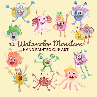
Monster Illustration Vectors that Work
Not all monsters are scary and we can apply them in a design composition or illustration. You may want to search bunch of new created monst...
If you like my Photoshop Brushes please give comment before you download them because I will appreciate any feedback from you.
Don't miss out to download my next photoshop brushes series by subscribing to my feed!
NOTE & UPDATE:
Graphic Identity - Fantasy Floral Part 4.abr (553.93 KB)
Graphic Identity - Fantasy Floral Part 4.zip (260.28 KB)
Graphic Identity - Fantasy Floral Part 4.rar (247.6 KB)
Graphic Identity - Fantasy Floral Part 4 (PNG).zip (575.6 KB)
Be sure to check this design set also
Fantasy Floral Vectors
Related Post: