Without further talks.. shall we see the round ups of 7 Design Video Tutorials:

Video Screencasts #47: CSS Shorthand
Read More

 2. Gold Text Effect
 3. Neon Effect
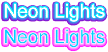
 2. XBox 360
 3. Folder Icon
 4. Translucent IM
 2. Statistics Icon
 3. Mac Os X Mail Icon Style
 4. Traffic Cone Icon
 2. Tracing photo
 3. Adobe bridge icon
 4. Pumpkin
This article post is a contribution to "Design you love: a group writing project". (Thank you to Mirko of Designer Daily who made this event possible). A late submission I know :D (due to my heavy scheduled tasks) but the main thing is that: I hope you all will enjoy this short design review. I've missed the blogging days moment and I miss replying wonderful comments posted by the wonderful you! Have a great weekend everyone :)
 2. Torch Light
  3. Flash Drive
 4. LCD Monitor

 3. Smoke Brushes
 2. Box Icon
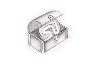 3. XP Style Icon
 4. Calendar Icon
 2. Clear Plastic
 4. Freezing Cold Text
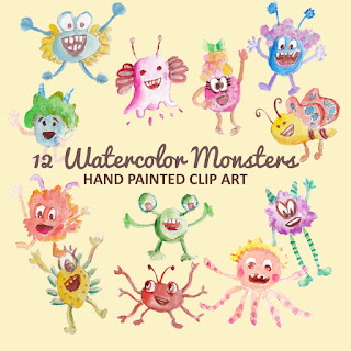
Not all monsters are scary and we can apply them in a design composition or illustration. You may want to search bunch of new created monst...


PhotoshopUser TV Episode 164
“Educating Clients to Say Yes” Presentation
Quick Tip #5 - Converting Anchor Points In Illustrator
jQuery for Absolute Beginners: Video Series
How to Create Glowing Elegant Lines
'KILLER' PHP Video Tutorials for Web Designers