I just want to share the design process with you and I would love to read your feedbacks too :)
Read More
The Design Concept
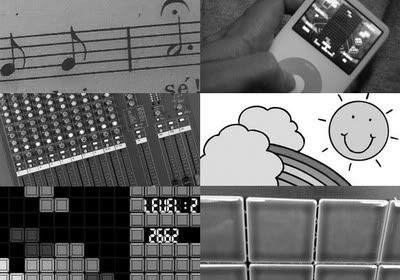
The idea was to bring a simple logo that correlates to Danielku slogan: "Music in Colors". As a start we think of a colorful music note. There were some facts to develop the basic concept into raw sketches: Daniel loves house/electro/dance musics and he produces music with drumpads.
Visual Concept Throughout the Sketches
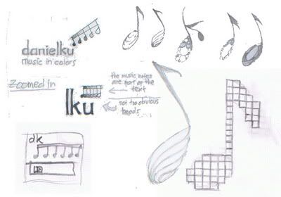
We tried to deliver the design concept with different arrangement of type, slogan text and the illustration part of the logo. Nevertheless, the music note could be very much closer to the basic idea compared to all which had been brought on using raw sketches. So we were focusing more to it.
The First Digital Stage
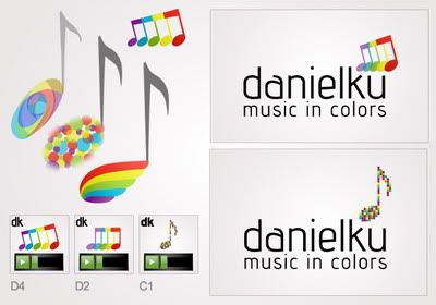
We made some alternatives for the head, stem and the flag of the music note. Some questions noted, such as: how the color would be shown on the music note's head? Should the music note be better appearing in Y axis or arranged diagonally? Where is to put the music note? The right proportion of it? We were also experimenting with the current logo trends: 'varidots', sequential layer of shapes, and also mosaic technique.
Simplifying the Alternatives
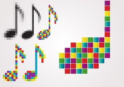
In the next stage, we went back to the main root, and start thinking about another possibility to combine the colored music note idea with the electro music vibes concept. It could be colorful, and playful at the same time. "Tetris" game was the great inspiration as it represents the digital lifestyle. Daniel gave a helpful feedback at this stage, that a colorful pixelated music is a great descriptive concept to develop, simple illustration and we've been hoping this concept can also be flexible to deliver its visual message behind the brand attributes.
Choosing the Font for the Logo Text
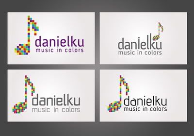
This stage was a bit tricky. We tried to use several fonts and the colors for the texts as well. I designed a set of custom vector font for this logo by the way. But for technical reason, we have dropped the design and we decided to use Advent Bold for the main text and Advent Regular for the slogan text.
Final Logo Design
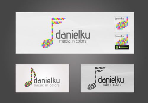
The refining process didn't take too much time. Because the logo stays simple from the beginning. The important part is to make this logo works good in all kinds of media (web & print) and in black/white version.
The music note pixels are colored based on this color scheme:
Color by COLOURlovers
In the final process, the flag of the music note was altered so it resembles the "f" character, as the slogan changed to: "Media in Colors". Daniel wants to keep his brand in good flexibility for his various creative works in music and also Flash animations. The pixel boxes make this logo becomes modular in each pixel unit. The avatar is using the head part of the music note, and it slightly shows "d" character. The ideas are mixed together and the result is a colorful monogrammed music note with consistent flexibility :)
If you want to see some more details about the Danielku logo, and with better presentation graphics of course. You can visit my Behance portfolio page.
UPDATE
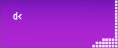
Recently we've made another version to fit the 'ActiveDen' marketplace environment. We selected two font characters that can symbolized Flash ActionScript, which are 'd' and '<' ~ so both characters create Daniel's initial.

wow now everyone can see how hard such a design process can be :) keep it up Audee, it was great to work with you
ReplyDeleteNice job! The logo's perfect for representing Daniel's brand identity. Looking at the logo design, I can say that there really is "music in colors".
ReplyDeleteGreat post. Kudos on the logo, I must say that it looks good.
ReplyDeleteDani,
ReplyDeleteMy pleasure :)It's more like a fun process to me Dani. I hope you experienced the same thing during the logo design development of yours. :D
Girlie,
Thank you for the nice words :) Yeah, the logo has a music note icon attached... and also with fruity colors ;)
Thanks for sharing this interesting design process and I must say that the logo design is quiet good.
ReplyDeleteWill be looking forward to see more of such posts :)
Michele,
ReplyDeleteThank you :) I was just doing my best for it.
Graphic Design Blog,
=) Anytime! The process was interesting, that's why I feel like sharing this is a must.
Nice. Good concept. I like the logo in the image "Final Logo Design" lower left corner. The curves in the top of the note are more dramatic than the other concepts giving it flow.
ReplyDeleteExcellent work! You are very talented & deserve much success. This logo is really top notch. :)
ReplyDeleteJennifer,
ReplyDeleteThank you for the comment on the curve 'flag' logo. I also like that version very much actually :)
Lauren,
awww.. what a surprise to have you here with nice comments and wishes! Thank you! I just doing my best for this logo :D
Love the danielku logo. Like the color combination. You rocks. Great design work. keep it up.Thanks.
ReplyDeleteGreat job...
ReplyDeletei like the post