
Somehow it is so easy and quick to produce. Lets get start now :D
Step 1 – Draw a curve with arc tool
Find the arc tool in the tool box, and start to draw a curve on a new canvas like this:
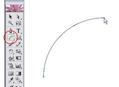
And draw another curve next to the first curve that you made.
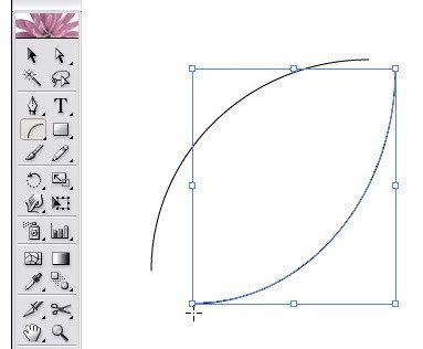
Connect each edge point so it becomes a closed curves paths like this:
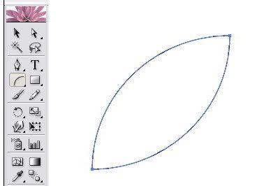
Remember: do not group those two paths because if you group it, you won’t find a nice blend effect as this tutorial will show you in the finish result.
Step 2 – How to blend
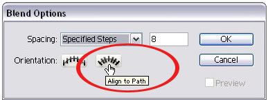
OK, now go to the menu Object > Blend > Blend Option and set it like what you see here:
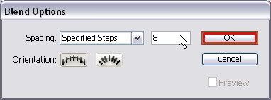
You can fill the Specified Steps with 10 or more. Just to let you know that the more you add the number of density of the specified step then you would create more dense curve lines.
Don’t forget to set the orientation of the blend as align to path.
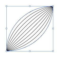
Back again to the menu, go to Object > Blend > Make (Alt + Ctrl + B), then soon you will see this on your canvas:
Step 3 – Creating a nice ribbon using warp tool.
Find a Warp Tool on the tool box. Warp tool is actually my favorite tool to create curves for my photoshop brushes collections ;)

Start to pull each edge of curve with this warp tool like you see below by dragging and release it until you feel the shape is perfect. You can do it repeatedly until you get a nice curve:
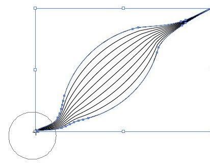
As you can see, we still manage the both edge. Now we try to tweak the center curve lines. Still using the warp tool, do it exactly as I told you in the previous step but now be focused on the center curves only.
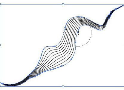
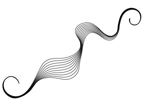
You will love this step, because every time you drag using the warp tool, you will get a random bends effect. Experiment a bit on another spot of curve lines. You don’t have to worry if somehow you see like broken curves after sometimes, just repeatedly shape the curve lines, you will get a nice ribbon effect again if you try a little bit harder. And here is my final result:

Wow finally a tutorial. I have been wondering how you created that beautiful design. Thanks again! :)
ReplyDelete:) You are always welcome..thank you for following my blog updates.. I'm looking forward for a chance to write a template tutorial up next .A blend between CSS and Photoshop..hopefully I can finish it this month :D
ReplyDeleteexcellent..Thank you for sharing!!
ReplyDeleteThanks for that great tutorial. It's amazing how something so spectacular can be made to look so easy to create. Thanks again.
ReplyDeleteWonderful! I'm such a n00b at Illustrator but really want to learn. Thanks for detailed instructions and screenshots!
ReplyDeleteKelsey,
ReplyDeleteyou always welcome :D
Web Design UK,
True, it is easy...don't get bored to experiment
Arielle,
Come back anytime for the next tutorial ;)
WOW!
ReplyDeletethank you for the tutorial
i just opened this site, and its cool!
i know nothing, so i wanna learn everything
thank you very-very-much
Hey,
ReplyDeleteWhat a lovely technique. It's a cool effect ^^
I'm having a bit of trouble with this tutorial... I hope you don't mind me asking you a few questions.
I managed to create the Arc Curves, but when I go to connect them, I don't think I do it right... because when I follow the next step (Object > Blend > Blend Option), I follow exactly what you said and it doesn't do anything...
Also, I don't understand what you mean by "Don’t forget to set the orientation of the blend as align to path."
Do you think you could explain it in a little more detail?
I'm sorry to be asking you all these questions, but I really would love to learn how to do this, but I'm new to Illustrator and therefore don't understand it very well... it would mean a lot to me if you'd help me out! :) thanks for taking your time to read this comment.
Banonbonan,
ReplyDeleteglad if this tutorial helps you to learn more about Illustrator :D
Rosanna,
Thank you for the compliment and asking the question :)Trust me! it is no problem at all for me...in fact, sorry for the late response.
It should be showing the blend FX. I mean, when you go to the Blend Option it is actually the stage where you can customize the appearance of Blend FX. For instance, if you increase the number of spacing (by Specified Steps), you will get different FX than fewer numbers (4, 5 or 8...). But, after you finish with this customization, you must go back again to the menu, go to Object > Blend > Make (Alt + Ctrl + B), then soon you will see the Blend FX on your canvas :)
"Don’t forget to set the orientation of the blend as align to path."
There are two types of orientations in the blend options box:
1. Align to Page
2. Align to Path
Well... I've managed to upload a new screenshot of what you need to know. Please take a look the tutorial above. Really hope it will help you a little :)
thankyou for the tutorial. I try to do that for my blog. thanks again.
ReplyDeletecould you give me some advice how do I do to change the template with my own design. I find some difficulties to make codes by html or css. i'm still learning
Hi Yulia,
ReplyDeleteThank you for your comments. If you want to change template for your Blogger theme, I suggest you to visit this page http://help.blogger.com/ or download free Blogger templates to learn the HTML and CSS structure from scratch. Simply Googling it, and you'll get tons of free blogger template lists on internet. Graphic Identity Blog is using "Classic Blogger". While the "New Blogger" has another kind of coding and CSS syntax.
wow,.wonderfully described. i appreciate it. thanks for sharing and let me know about this.
ReplyDeleteThanks!!! this is a great tut, can't wait to try it out
ReplyDelete