This tutorial will show you how to use CSS to create rollover image buttons/menus using relative position. There maybe some other ways to create the same rollover effect. I’ve learnt about this from Veerle’s old post about Div thinking cap. I wasn’t realizing of how important this technique for my design until I had a project that required me to create uneven (unordered) menu placement with lots of motive texture as the background.
If you get interested or you even still don’t get me :p , please have a look to the demo webpage. And let’s have fun with this tutorial!
CSS DEMO >>
GETTING READY WITH THE IMAGE ICON
Step 1 – Creating a master background
Create a master background using Photoshop, Be creative as your background design can be part of header, sidebar decoration, search box or any part in your website. My example here is simple :D I just want to show how these random positions of buttons / icons are possible to be done with CSS relative position techniques. The icons that I’ve used for the design are Social networking icons created by FreakGroup.com.ar.
They are very nice icons with smooth gradients FX on each of it. The Facebook and Stumble Upon icons are not included in the download pack; because of it I have designed them with the same style as what in the pack.

Step 2 – Cropping
After you finish, save the file both in .JPG and .PSD then duplicate the .PSD as a new file. The next thing to do is to crop the image of button or icon that you wish to have rollover FX on it. After that, merge the layers down.
NOTE: I think .PSD saved format will help a lot if you need any changes to the layout or the icons. So consider to always save the master background in .PSD file as backup.

Step 3 – Working with the cropped image icons
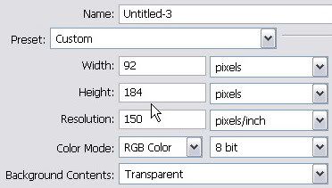
You will need to put on a note about the precise image size of your cropped icon. In this case, the size was 92px x 92 px. Create a new file with the exact width (92 px) of icon size but put it doubled for the height, that is 184px. Make sure that you always create a new file with the same image resolution as the first image background.
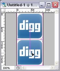
Go back to the cropped icons file and duplicate the background layer. Then drag to the new empty file that you’ve just made. Show the smart guides by entering menu: View > Show > Smart Guides. Place the icons layer on the top of the empty file. The smart guides will show the exact alignment as you can see red thin line appeared if your icon layer edge hit the image border. Duplicate the icon layer to have another same icon image and place the second copied layer to the bottom side. Below is an illustration of the precise layers placement.
Step 4 – Adding gradient effect for the rollover icon stage
Work on the bottom icon layer, and create selection using Rectangular Marquee Tool.
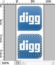
Go to the menu Select > Feather (Alt + Ctrl + D) and fill the Feather Selection Radius for 3px.

Find the Gradient Tool. Set the Default Foreground and Background color or by pressing D key, and put the settings on the menu options just as shown below:

Be sure that Dither and Transparency box are checked.
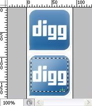
Drag your cursor into the selected area until you get the nice gradient effect as you desire.
The result should be like this:
Save the file as .GIF file and do the same with the rest of the icons (begins from the Step 2).

NOTE: You can create rollover state effect with your own creativity. If you have unrasterized fonts on your button or icon, you can change the color of the font and styles to differentiate it from default state.
INTEGRATING ICONS TO THE LAYOUT
Step 1 – The master background’s CSS
You will need the master background image that was created on the first step of the previous section. The styles consist of this:
#background-button {
width:500px;
height:500px;
display:block;
background-image: url(..../image/demov1.jpg);
background-repeat: no-repeat;
margin-left:130px;
}
Step 2 – The icon’s CSS
Now it is time to put rollover effect to the icons. The good thing about using this CSS technique is because there is no (loading) delay when people mouse over the icons. The icons image that we’ve created in the previous stage are included both the default and rollover state. Let me show you the CSS to achieve this effect:
#digg ul {
width: 92px;
height:92px;
position: relative;
float:left;
top:13px;
left:125px;
background-image: url(..../image/digg2.gif);
z-index: 150;
list-style-type: none;
}

#digg ul li a {
background: url(..../image/digg2.gif) no-repeat left top;
width: 92px;
height: 92px;
display: block;
text-indent: -9999px;
text-decoration: none;
}

#digg ul li a:hover {
background: url(..../image/digg2.gif) no-repeat left bottom;
}
Presumably you find some problem in I.E. 6, you can add this short CSS hack:
* html # digg ul {
top: 3px; }
Step 3 – The HTML structure
The relative positioning in this CSS technique should be better applied than absolute positioning. Because absolute position would make the icons stays at a certain location even when the window resized.
Veerle explained this on her tutorial Div thinking cap, The left and top coordinates are always in reference with the container it is in. In our example that is the background-button div container since the icons is part of the background-button. This is the HTML structural markup:
<div id="background-button">

<div id="digg">
<ul>
<li>
<a href="http://digg.com/users/kukuhumi/" title="Graphic Identity Digg profile" target="_blank">Graphic Identity Digg profile </a>
</li>
</ul>
</div>

</div>
Step 4 – Icons to background positioning
#digg ul {
width: 92px;
height:92px;
position: relative;
float:left;
top:13px;
left:125px;
background-image: url(..../image/digg2.gif);
z-index: 150;
list-style-type: none;
}
In order to get the top and left coordinate’s position value just like the Icon’s CSS above; you will need to experiment with numbers. This process is quite alike to a puzzle game actually :D. I suggest that you can start with the range of 100px for both top and left positions and see how it looks on the layout after you save the CSS settings. After that try to decrease or increase the position value for each position. Resave the file and reload or (ctrl + R) your browser to do the position check. Do it for several times and by this time, you should notice how much exactly the numbers of value to be added until you get the nice position of the icon as the master background shows. Sometimes you may go with negative value as well to fit your icons to master background. :D Crafty but it works!
Do the same step 2 and step 3 with the other icons.
Hey I have no idea to make these things whole lots easier, maybe you can suggest me something guys, just feel free to comment if you like! :*
Related Post:

thnxs for this, looks like a handy tutorial. :)
ReplyDelete;) Little bit crafty to start the same concept of tutorial next time. But I think combining photoshop and css mark up is going to be the next trend post for blog tutorials...rrr, do you think so?
ReplyDeleteI am just learning photoshop and this is really very inspiring
ReplyDelete