Animatrick.com has invited all the group members to have cross reviewed blog, (especially if you have PR 2 blog). I think this is a wonderful idea, because by doing this you can have more people to give constructive criticism over your blog or website in detailed explanation. Getting another comment in a different point of views and hopefully you can have better designed website and good quality of content in the future.

Animatrick.com is a resource website of WYSIWYG ADOBE Tutorials for After Effects, Flash, Illustrator, Photoshop, Premiere and Sound. Parviz is the founder of this cool website.
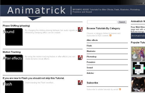
The website logo header is unique in design and concept. By adapting "A" typeface on crimson color background and the magician hat with the magic stick. This concept is able to drive viewer's attention to understand the idea of this website, that Animatrick.com is a website with resourceful tricks and tips for every designer.
The layout is dominated in white, the main content is placed on the left and the two wide sidebars are on the right side. At the first glance, this layout looks clean and properly arranged. As you can see, there are white spaces everywhere to avoid the clutters. Nice and neat typo hierarchy. Featured of popular tutorial on the very left sidebar is another way to make easier to navigate the most visited page using thumbnail pictures of tutorials. It would be better, if these pictures have some kind of title tag for each link.
You can browse the graphic tutorials by category and they are the tutorials are:
- After effects
- Flash
- Illustrator
- Photoshop
- Premiere
- Sound
- Articles
Another feature in Animatrick and of course good news for you who runs a graphic design blog is Animatrick Web Directory. This directory will bring benefit to you, when you want to grow your traffic, reputation and page rank with a listing in our web directory. Free and featured listings are available. You can also submit your site for Weekly Competition. Recently, Animatrick.com has been also inviting you to join banner exchange program.
Cool things ;)
However, I have another opinion for the Animatrick.com. I found out that this website is build with layout tables instead of using CSS. It is also surprising me that the tutorials and articles are put on the main content using frames and scrolls. The reason I brought this into the review, is this website may have more advantages if the founder cold somehow redesign it or rebuild it using pure CSS mark up. There is a great old article from A List Apart: Where you can find the differences between table and semantic markup, at the implementation level.
I have to say that this website is way too wide for small screen user. I think rebalancing the two sidebars as, when the very left sidebar is built in 330px and the next one is just 250px, will somehow decrease the website's width into something that is comfortable enough for the readers.
Another thing is the navigation menu on the top right of the layout. As the width of this website is almost 1200px, it took me a while to seek the "Home" link when I was landed on tutorials section. I was using small width screen, when I realized later on that by scrolling to the right I finally found the navigation links. These links are better seen if they are designed on tabs menu as I've seen poor contrast quality of the links typography with the dark background of the header.
Somehow these sorts of design review are meant for positive intentions ;)
I just wish Parvis best of luck with everything that has been done to the website so far and to promote Animatrick.com.


No comments:
Post a Comment
If you like Graphic Identity's articles & our free design box, please drop your comment or subscribe Thank you :)
NOTE:
GraphicIdentity admin will always moderate all comments. We will not publish comments that include irrelevant links with targeted anchor text. Also it will be nice if you mention your name rather than to comment as an anonymous user.