You will need to take a look of some Web 2.0 design resources before we get in to our today’s tutorial. When you use one of those resources, please credit the original designers for appreciation and read his or her design copyright before you apply them to your design.
Certain design elements which are frequently implemented on Web 2.0 themes are:
1. Fonts and Typography – Big Size Text for Headings.
The trends will however show you bigger text in order to improve functionality in layout design. Bigger text is more accessible to more people, and font sizes range between 14 and 16. The consequences of using big text, you have to make room by simplifying, removing unnecessary elements. There are also tendencies to have less contrast between text and background. Darker background would benefits users of new computer that has brighter screen.
2. Round Corner
Round corner in web 2.0 sites seemingly polished to create informal invitation. This cozy form is chosen for comfort eyes when searching down from header to footer.
We have included this design element to the Web 2.0 resource list and round corners can be generated from:
- Online round corner generators
Round corner generators should be easy for anyone who probably doesn’t know of how to use CSS or graphic application. Really a time saver! - CSS
This CSS round corner will let your web page load faster, since you don’t have to add big size of image as background in html markups nor CSS techniques. - Photoshop or illustrator application.
It has the advantages to create more variation of FX, for instances: more options to use background color gradients, fading out some other sides of corners, more option to add sleek border FX, etc.
3. Color Scheme
If you notice carefully, color schemes in Web 2.0 genuinely consist of vivid colors to add more contrast over some part of page element AND shades of greyscale ranges from Shiny silver [#EEEEEE] to Shadows Grey [#36393D].
They are greenish, as it works like a charm on Techcrunch and Technorati. Flickr and Odeo Pink should be popular for star badges and icons. Bold and saturated blue as well as RSS orange are also common. Little bit red on Last.fm and Blog Catalog add up some spice to the pale white – grey background.
4. Gradients, Glossy, and Reflected Effect
Web 2.0 was a breakthrough from a static and none semantic rules kind of website into modern and dynamic website that talks visually to achieve interactivity and functionality with the viewers. There is an interesting article debating of how people have started following Web 2.0 trends without further learning of design concept process. Onur Oztaskiran has a personal opinion on the article: “How Web 2.0 Style designs disturb me”
The use of gradients, glossy and reflected effect is so much about Web 2.0 style, but being excessive with those effects could make your site gone out of focus.
Bear in mind that special effect is good, but put it or use it for the right spot! Less is more and keeping it as simple as possible.
5. Miscellaneous vectors shape and image style
Glossy button, big RSS icons, Stars badges are everywhere… :D Oh so cute, and shiny....
The looks are simpler than the old times style. Again, I shall remind you to give some space to your website layout structure even if you have to use some of them.
They are easy to create and even you’re not good to make one, internet provides you tons of links to download the files and they are ready to use. Find some of cool buttons, badges and icons on the Web 2.0 resources.
Regardless of how you want your Web 2.0 design style going to look like; you don’t have to implement every of those simple guidelines on your design. Consider it twice, in which part of element that need some retouch and experiment is the best
There will be another post for tomorrow’s tutorial following this section. You can also subscribe to Graphic Identity by RSS Feed or by Email if you like to follow the next updates :)
UPDATES:
WEB 2.0 THEMES ON INTERNET:
Pixel2Life
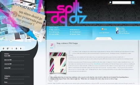
Split Da Diz
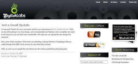
StylishLabs
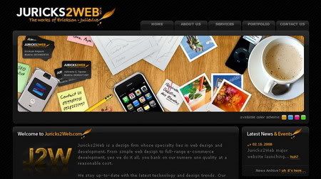
Juricks2Web
Related Post:





Enough with the chit chat let see what you can do ;)!
Reader Appreciation Award at Logo Design Love
There are 10 award categories of logo submission. As well as an outright winner decided by the judges, you are also invited to vote by leaving comments on the individual category posts. Add a comment below every post category as your favourite design (or 1st, 2nd and 3rd favourite). Once all categories have been published, the votes will be counted and the final round featured .
Categories already published are hyperlinked. The remainder will follow very soon. Find these 10 logo design categories and start your votes now!
* Business blogs
* Design and photography blogs
* Entertainment blogs
* Environmental blogs
* Health and self-development blogs
* Marketing and PR blogs
* Personal blogs
* Political blogs
* Technology blogs
* Miscellaneous (for everything else)
Blog Design Madness
The Blog Design Madness competition is now officially underway! There are 64 blogs that have been chosen, and the participants are all listed in this post. Because each competition requires a separate poll, Vandelay Website Design needs to break up the first round into 2 parts. There are 16 matchups in this post involving 32 outstanding blog designs, and the second half of round one will come in a few days.
Each matchup includes a poll, links and a screenshot of both blogs. Vote for your favorite blog on Blog Design Madness: Round One now!
Here are the competition participants:
* Freelance Switch vs. Mark's Digital Farm
* Vocino.com vs. You the Designer
* Pro Blog Design vs. Tim Kadlec
* 9513 vs. Webstock
* Grand Sierra Magazine vs. Elitist Snob
* The Big Noob vs. Blog Design Blog
* Reflections vs. Trailer Flick
* David Airey vs. Kollermedia
* ProBlogger vs. Sully's Design Studio
* Artico vs. Young Go Getter
* Cult Foo vs. N. Design Studio
* Robert Beerworth vs. Noupe
* Laura Alter vs. Loon Design
* Rob Goodlatte vs. A List Apart
* Josh Spear vs. Mostly Lisa
* PSDTuts vs. Bart-Jan Verhoef
UPDATE:
There were 32 excellent designs to decide on, and the winner of this second half round one are:
Freelance Switch vs. Mark’s Digital Farm
Winner is Freelance Switch
Vocino vs. Youth the Design
Winner is Vocino
Pro Blog Design vs. Tim Kadlec
Winner is Pro Blog Design
9513 vs. Webstock
Winner is 9513
Grand Sierra Magazine vs. Elitist Snob (this poll was tied, so I took am removing my vote for Grand Sierra Magazine and using the readers votes of 15 to 14 in favor of…)
Winner is Elitist Snob
The Big Noob vs. Blog Design Blog
Winner is Blog Design Blog
Reflections vs. TrailerFlick
Winner is Reflections
David Airey vs. Kollermedia
Winner is David Airey
ProBlogger vs. Sully’s Design Studio
Winner is Sully’s Design Studio
Artico vs. Young Go Getter
Winner is Young Go Getter
Cult Foo vs. N. Design Studio
Winner is N. Design Studio
Robert Beerworth vs. Noupe
Winner is Robert Beerworth
Laura Alter vs. Loon Design
Winner is Loon Design
Rob Goodlatte vs. A List Apart
Winner is A List Apart
Josh Spear vs. Mostly Lisa
Winner is Josh Spear
PSDTuts vs. Bart-Jan Verhoef
Winner is PSDTuts